Brighton Fringe Festival
As the largest annual arts festival in England, the Brighton Fringe Festival sets out to stimulate, educate and entertain all year round through a diverse range of events and performances.

My role
Working as the Senior UX/UI designer at Grandad Digital the main focus was to refine the information architecture allowing discovery of performances according to users search criteria, whilst creating an engaging visual experience with bags of the Brighton Fringe brand personality.
With the client and the team collectively we had to understand and prioritise the existing problem areas. By running user workshops that defined user personas and crucial flows, and by reviewing content and priority through card sorting, we had a stronger understanding of the problems, solutions and possible opportunities.

Research
Working from the user discovery phase I ran a full content audit. With suggested improvements and modifications to the information architecture, according to user research and business requirements, we were able to better house content with more tailored flows and structure, allowing me to deliver a refined and focused IA.

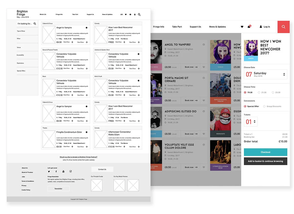
Prototyping critical flows
I created a full suite of wireframes as working prototypes, across critical flows on desktop and mobile. Allowing us, the client and selected users to test the critical flows and fully explore their solutions before we embarked on the production phases.
Focusing heavily on the selection of performances, and then booking tickets, I developed a single unified payment flow that allowed users to book and purchase tickets efficiently and effortlessly.
Defining the visual language
By designing a rich, on-brand experience for all users, brimming with that Brighton Fringe brand personality, we were able to develop a product with a fresh look and tone, that was bold and engaging.
At the beginning of the design phase we had a couple of design revisions from the client to steer direction before rolling out the final approved aesthetic.

The design had to be adaptable and flexible. By using a modular block approach, and with some simple changes to the CMS the client can update the visual aesthetic yearly with new colours and page structures that reflect the Fringe theme for that particular year. Giving the client a refreshed new site year on year.


Brimming with the Brighton Fringe brand personality!


